Project Title
Redesigning the Onboarding Flow for Monster.com
Creating a stepped onboarding flow that would encourage users to finish their onboarding.
Role
I was the Lead UX Designer throughout the project. My responsibilities included working with user research, concept ideation, aligning key stakeholders on product goals, designing user flows, visual design, prototyping, user testing, incorporating user feedback into design iterations, and quality assurance. I also collaborated with the design and development teams to brainstorm ideas and problem-solve.
Project Summary
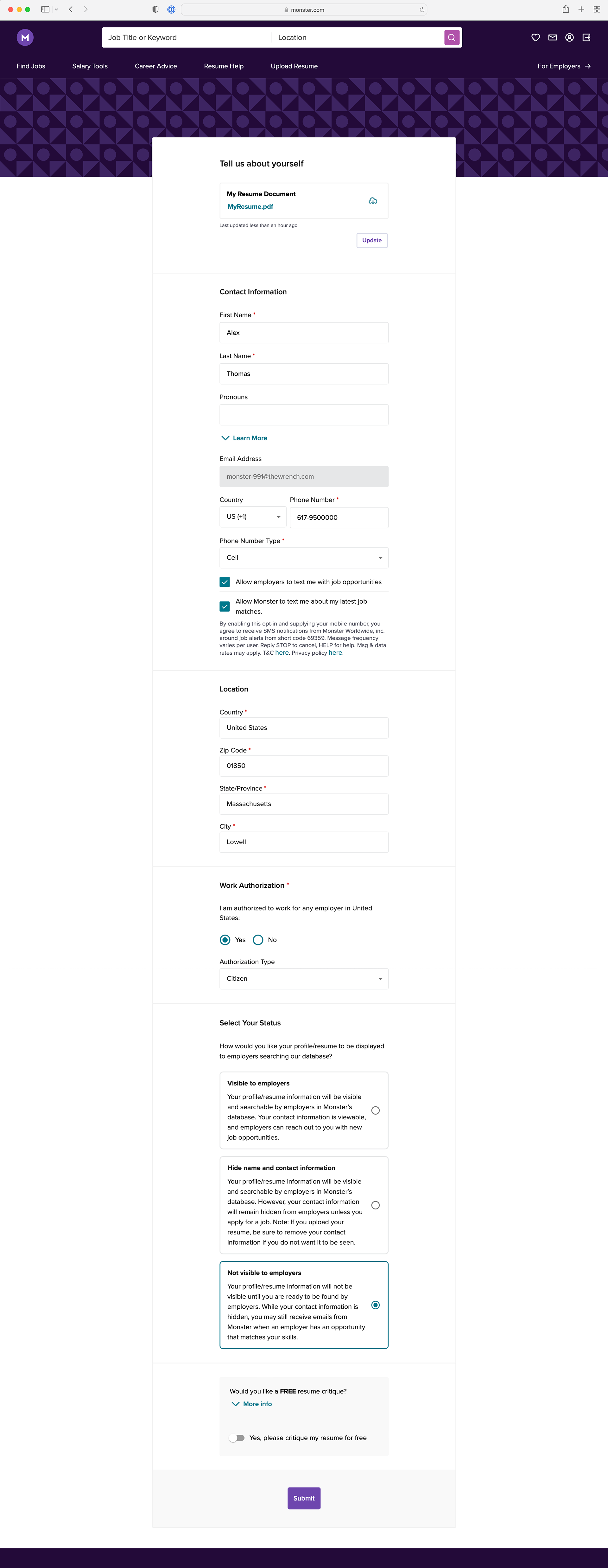
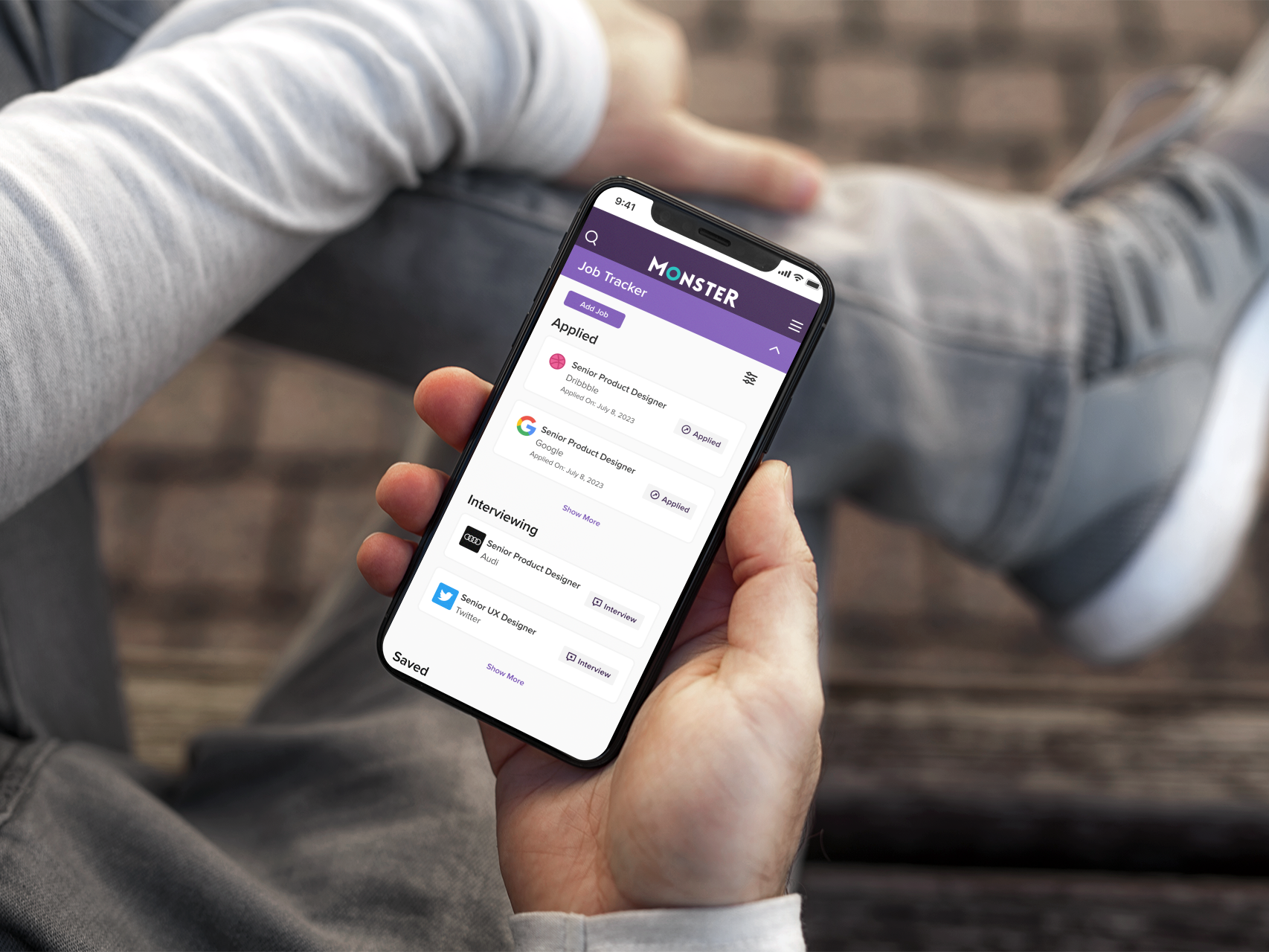
The company monster.com is essentially a job board. They earn money by having users click and view jobs. They also earn money by offering employers searchable resumes. During onboarding, users are offered a way to upload their resume. Unfortunately, many users skip that step, especially if they are on a mobile device. Some users don’t even finish the onboarding and Monster is left with a number of unsellable resumes.
The Challenge
The previous onboarding process presented the user with a long form to fill out. There was no pacing or guidance given to the user. Product owners also want the new onboarding process to be more modular so it would be easier to test different orders to see which one brought them the most complete user profile. This needed to be accomplished without reducing the current onboarding completion rate.
The user base for this project consisted of millions of people in the 18-45 age range from many countries around the world.
Solution
I analyzed the current structure of the onboarding flow. I gathered usage and engagement data from the current experience. I collected many successful and unsuccessful examples of this experience from other apps and websites to perform a competitive analysis.
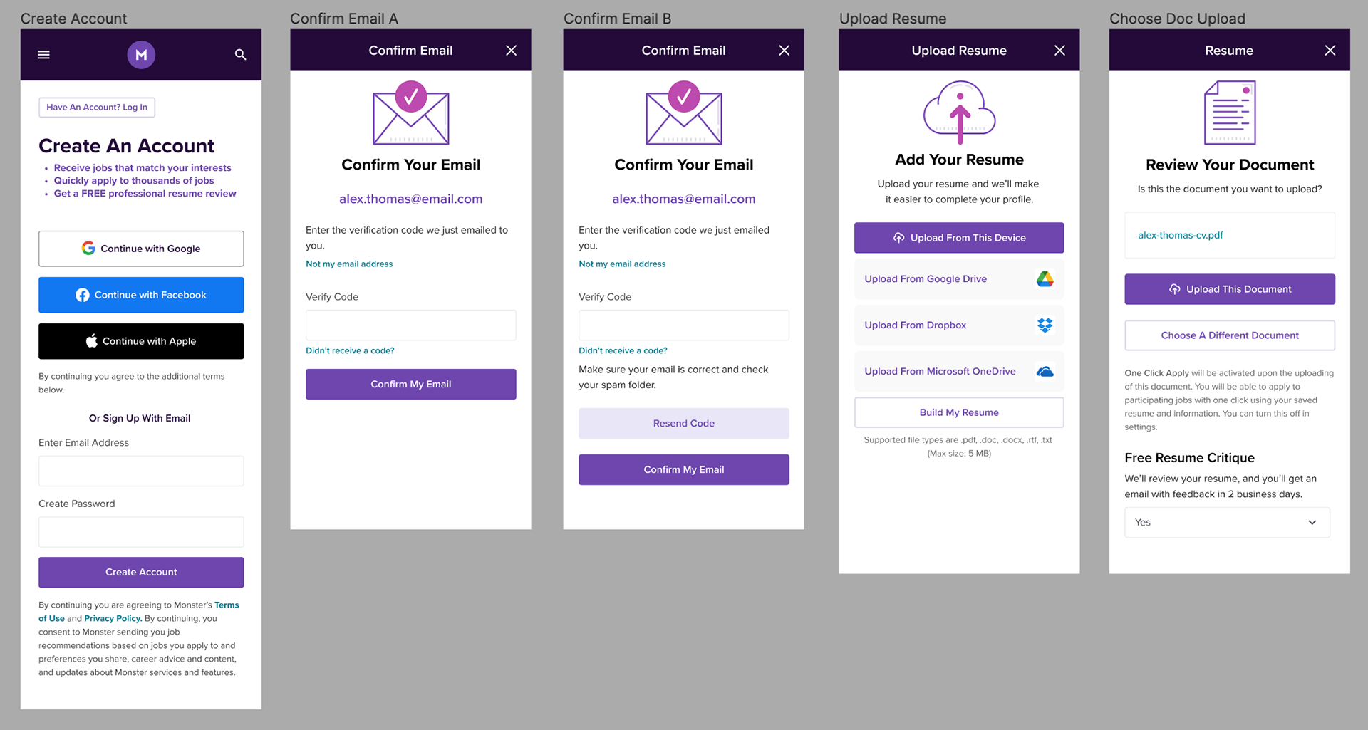
There wasn’t just one onboarding flow to be concerned with. There were a number of ways a user could enter this flow and a number of them included when the user was applying to a job.
The flows were:
Create account / upload resume
Create account / no resume / build resume
No account / apply offsite free job /
No account / apply onsite / upload resume
No account / apply onsite / build resume
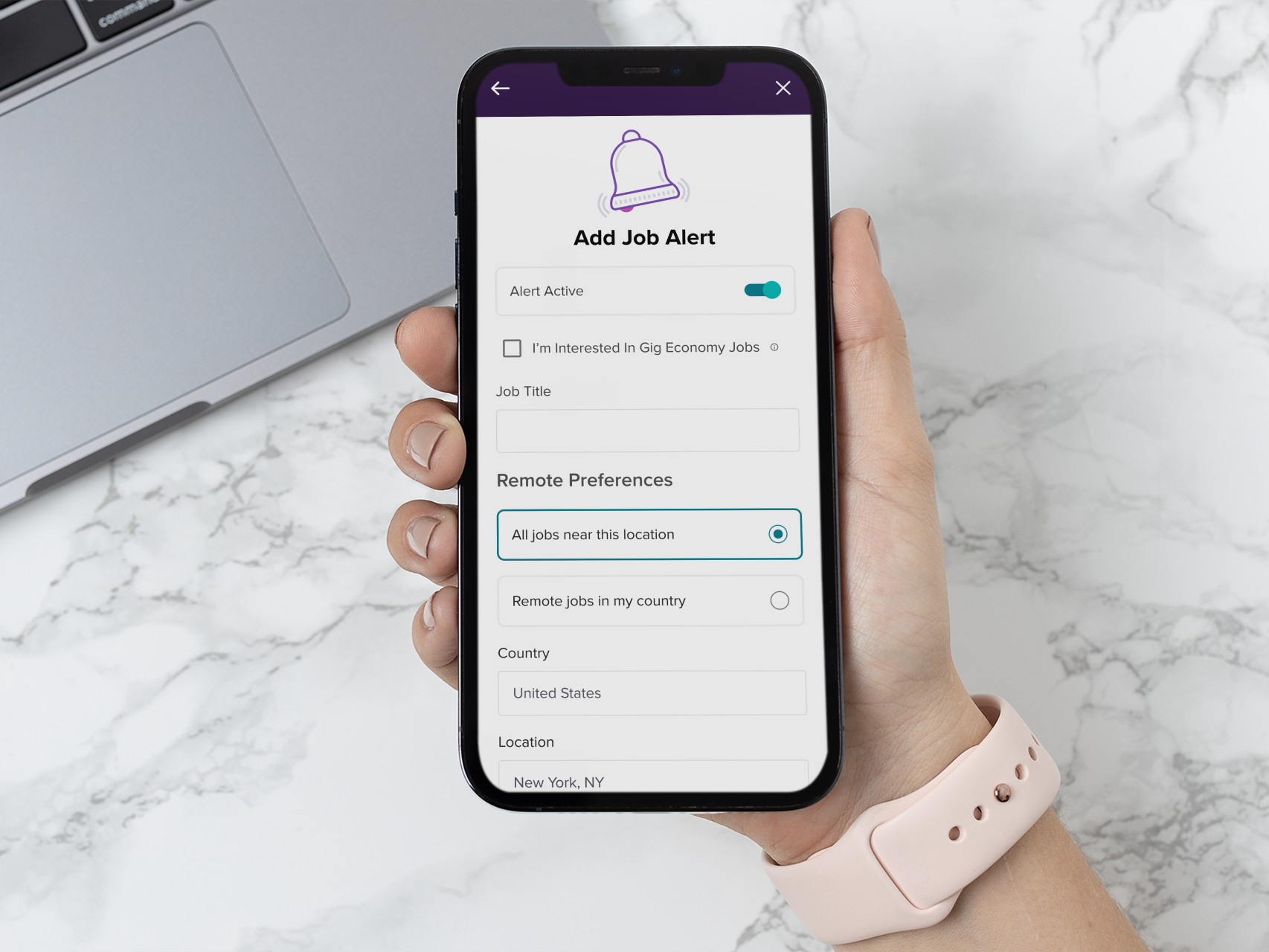
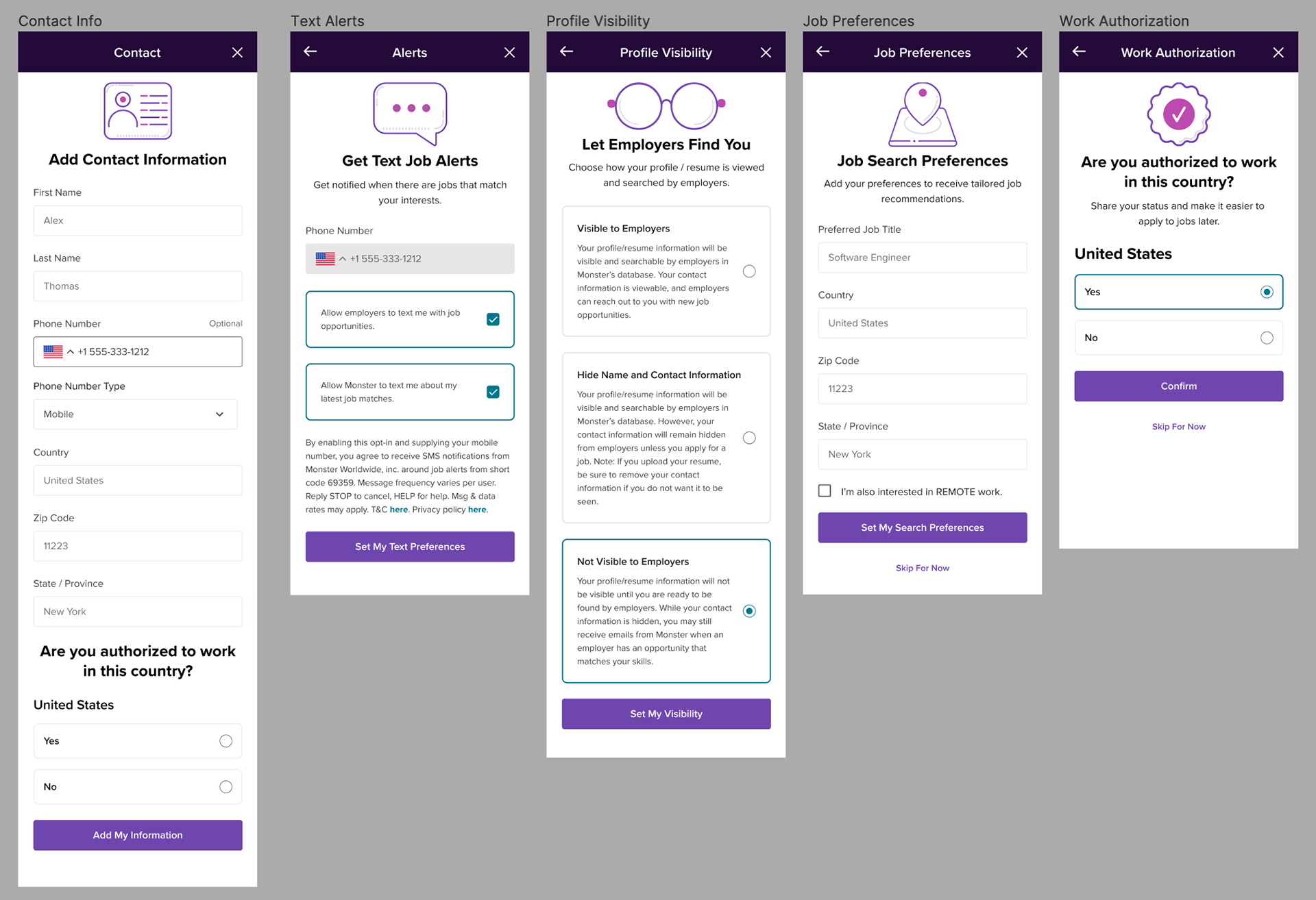
I broke up the original flow to make it more modular and also created a series of icons to help the user discern they were in a new section of the onboarding. I started with the basic onboarding flow where users would decide to create an account. I determined many of the flows would use part of this as a base. We debated adding numbers to the steps to show progress and an endpoint, but it was shelved due to some development issues.
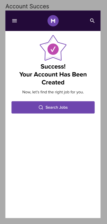
Usability testing was done by comparing the original onboarding flow. The overall opinion from users was that it was more pleasing to them, they felt more “in control”.
Weekly sessions with the product owners and product development helped to validate, test ideas, and iterate quickly. Figma was used to create prototypes.
During the initial rollout, it was decided that we would do A/B testing in the UK at a 5% and then 10% rollout to see if there was a drop in onboarding. It then expanded to 100% and eventually to many more countries.
Features
To overcome the issue of users finding it difficult to upload a PDF on a mobile device we offered a way for them to build their resume from scratch during the onboarding, if they decided to. This was built as a stepper as well.
The modularity of the new design allowed us to more easily change the flow in the future if we saw a drop off in the flow or remove it altogether and encourage them later on their dashboard to finish up their profile.
We also added the feature of a One Click Apply where users would be able to apply to most jobs with one click using their profile. This option would automatically be turned on if they uploaded a resume.
Results
8% Increase In Successful Onboarding
We observed a decline in user engagement when it came to adding their work and education history. In response, we decided to expand the test to a larger group of users, but unfortunately, the problem persisted. It became evident that while users appreciated the step-by-step onboarding process, they encountered difficulties when it came to editing their work and education details. Initially, we assumed that users would prefer a stepped approach for completing their information, but it turned out that this approach didn't work well in the work and education section. We went back to the longer form for those sections.
Reflection
We met the goals we set at the start but were surprised with the engagement drop-off in the work and education history section. Possibly a more in-depth user test would have shown this issue.
Previous Onboarding