Project Title
Monster.com Job Seeker Dashboard
Simplifying the job application process while incentivizing return visits
Simplifying the job application process while incentivizing return visits
Role
I was the Lead UX Designer throughout the project. My responsibilities included working with user research, concept ideation, aligning key stakeholders on product goals, designing user flows, visual design, prototyping, user testing, incorporating user feedback into design iterations, and quality assurance. I also collaborated with the design and development teams to brainstorm ideas and problem solve.
Project Summary
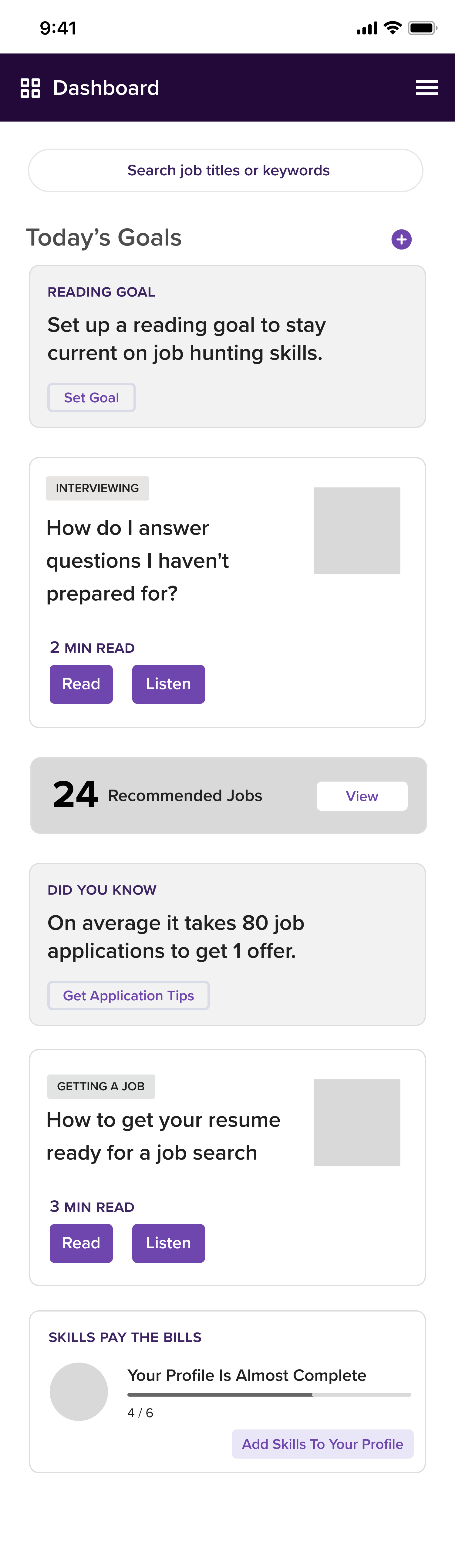
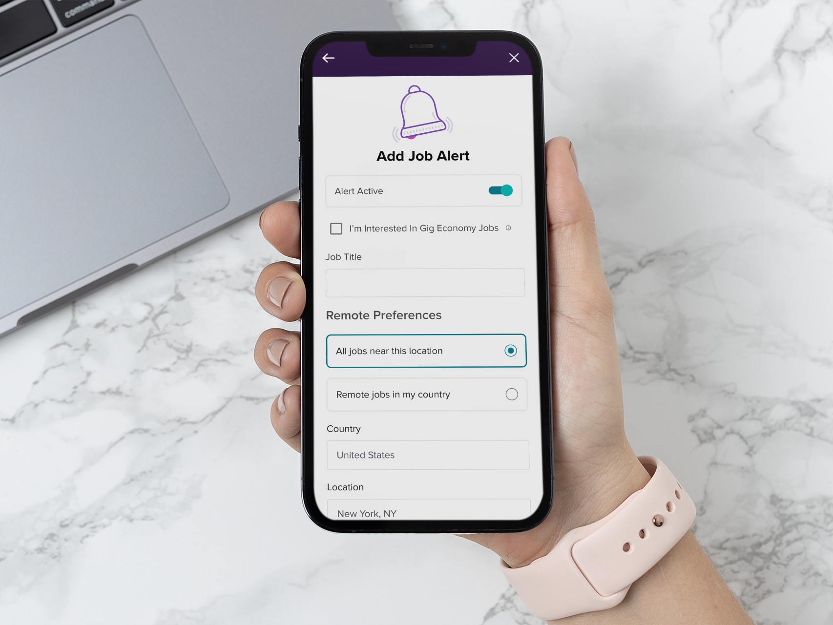
The dashboard was created to offer a user-friendly experience that simplified job hunting while incentivizing users to return to the site regularly for helpful career articles, easy job applications, and a way to track all of their applications.
The Challenge
Some of the important business objective were to have the user feel like they were in control of their job search and apply process. Previously after users logged in they would be in an experience that didn’t really guide them. The main action the user could perform was a search or apply for a job action. We also needed users to want to make return visits to the site, not only to look for jobs but also have them feel as if it was a place that they could learn more on how to find a job, how to interview, how to know what a hiring manager was looking for, and to give them guidance on what to do for each step of the application process.a
The user base for this project consisted of millions of people in the 18-45 age range from many countries around the world. We asked users what they would want while searching for a job online. One of the most often repeated requests was a way to track progress through the process.
Solution
This was definitely not a single iteration process—we had to account for product owners, product development, and continual feedback from leadership. I collected many successful and unsuccessful examples of this experience from other apps and web apps to perform a competitive analysis.
I started with low-fi designs that used some of our existing components from our design system. I tried to stay very close to our existing components and only deviated from them when needed. Weekly sessions with the product owners and product development helped to validate, test ideas and iterate quickly. Figma was used to create prototypes.
During the initial rollout it was decided that we would do A/B testing in a few countries to see what was working well and what was not with users.
Features
The development was broken up into phases.
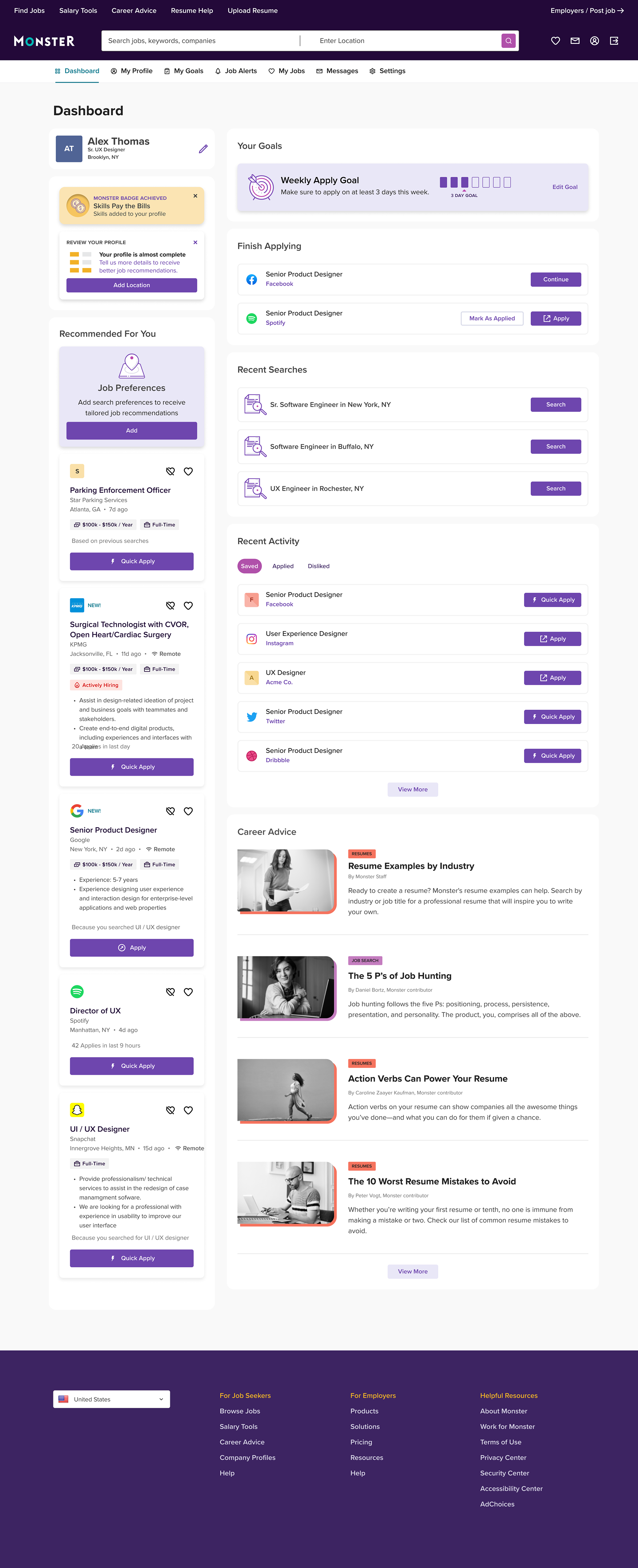
Phase One: Enhance What We Have
1. Show Relevant job listings (main activity)
2. Recent Searches (ease of use on return visits)
3. Recent Activity (keep track of what you’ve done)
4. Career Advice Articles (encourage return visits)
2. Recent Searches (ease of use on return visits)
3. Recent Activity (keep track of what you’ve done)
4. Career Advice Articles (encourage return visits)
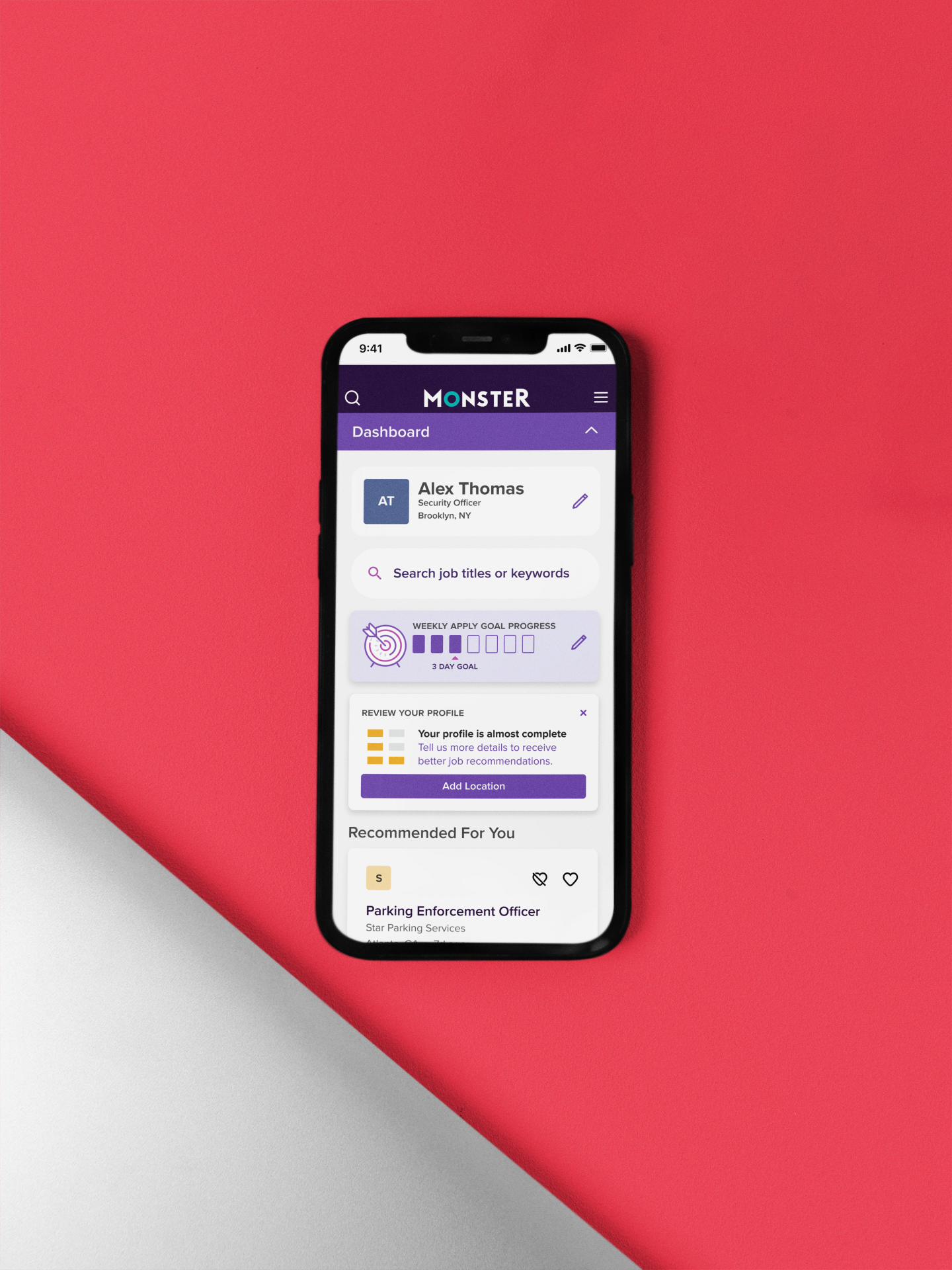
Phase Two: Return Visits
1. Encouragement to fill out their user profiles (encourage return visits)
2. Setting job apply goals (encourage return visits and applies)
3. Gamification, create a series of badges users could collect for filling out their user profiles and hitting their apply goes (encourage return visits)
2. Setting job apply goals (encourage return visits and applies)
3. Gamification, create a series of badges users could collect for filling out their user profiles and hitting their apply goes (encourage return visits)
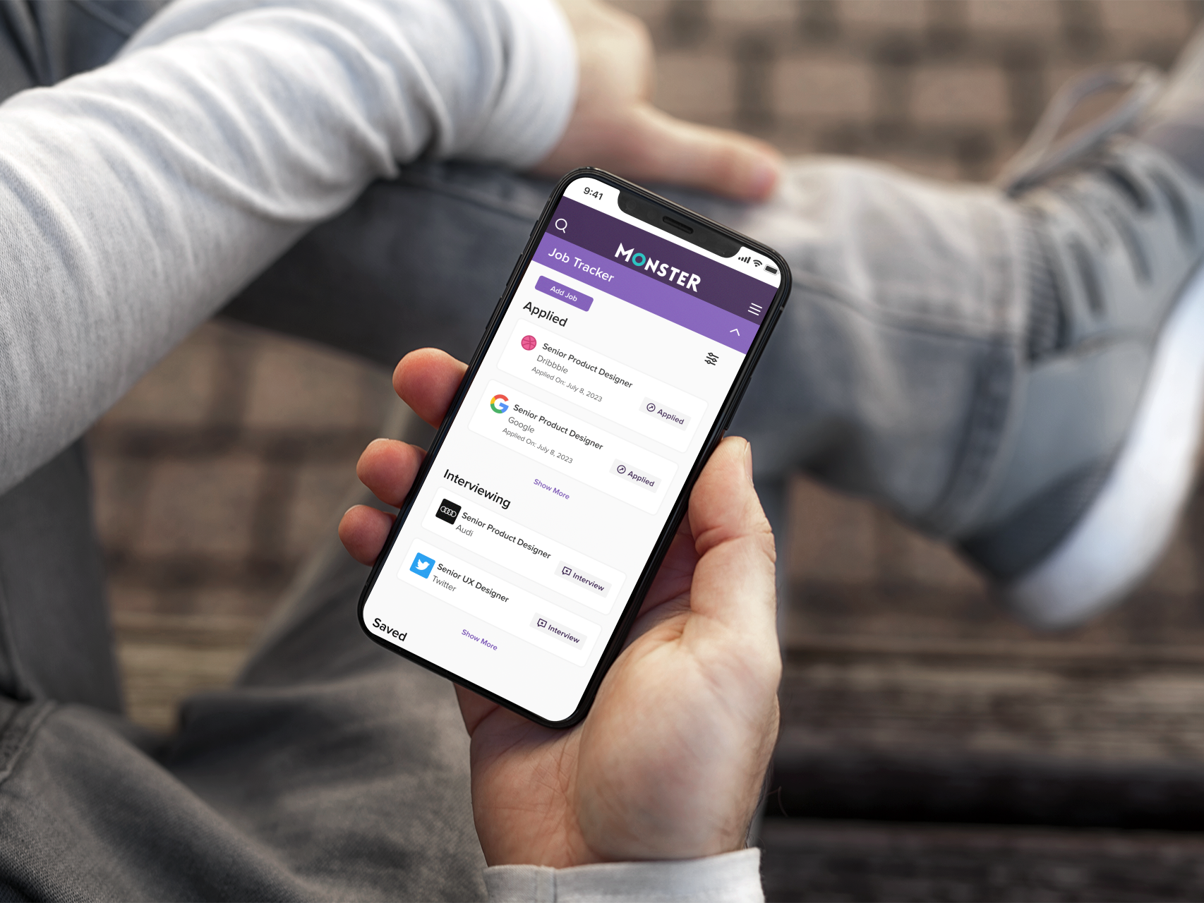
Phase Three: Job Tracker
1. Creating a job tracker to follow a job through the following jobs statuses: Saved, Applied, Interviewing, Negotiating, Accepted, Archived
2. Get guidance on what to do at each step
3. Allow users to track jobs not served by monster.com
2. Get guidance on what to do at each step
3. Allow users to track jobs not served by monster.com
Results
20% Increase in Return Visits
7% Increase in Job Applies
Job Tracker still being worked on
7% Increase in Job Applies
Job Tracker still being worked on
Reflection
Looking for employment can be a stressful time and I enjoyed working on solutions that met our business goals while also making this activity a little more stress free for our end users.
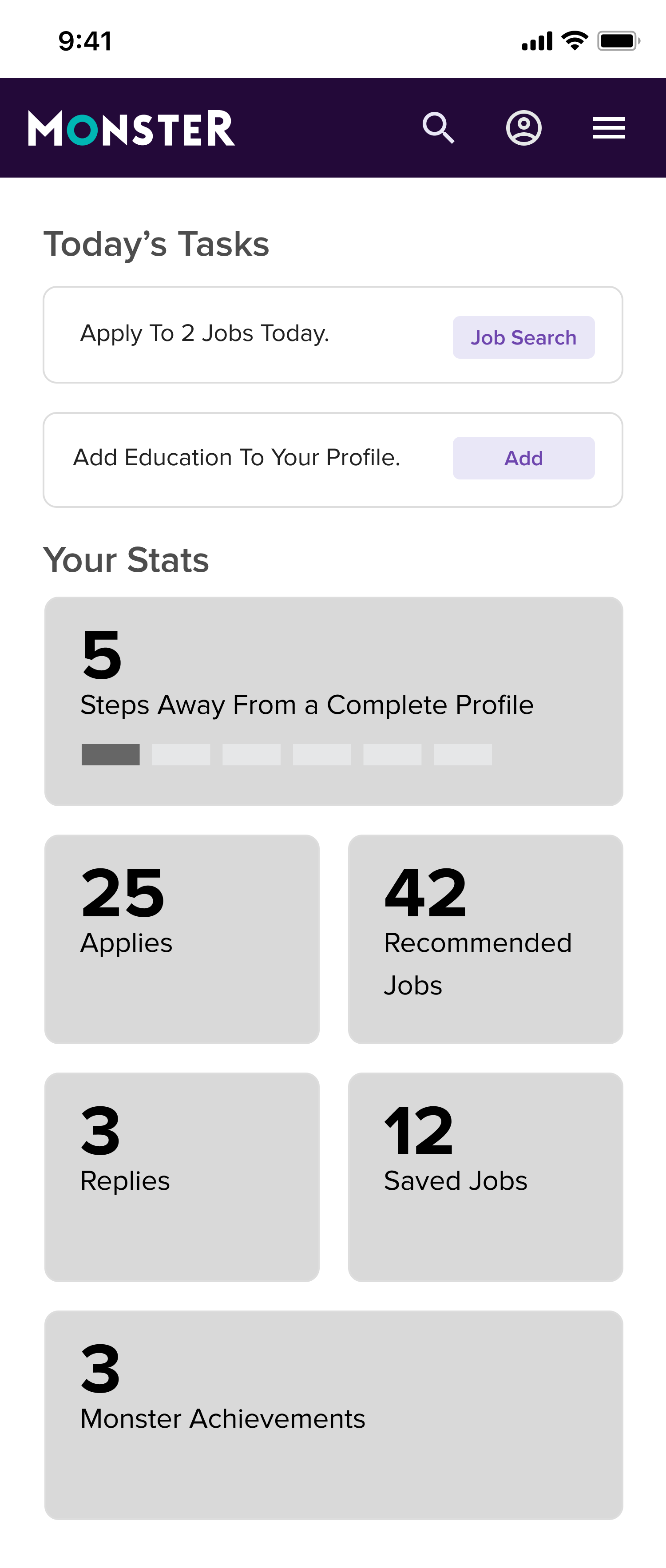
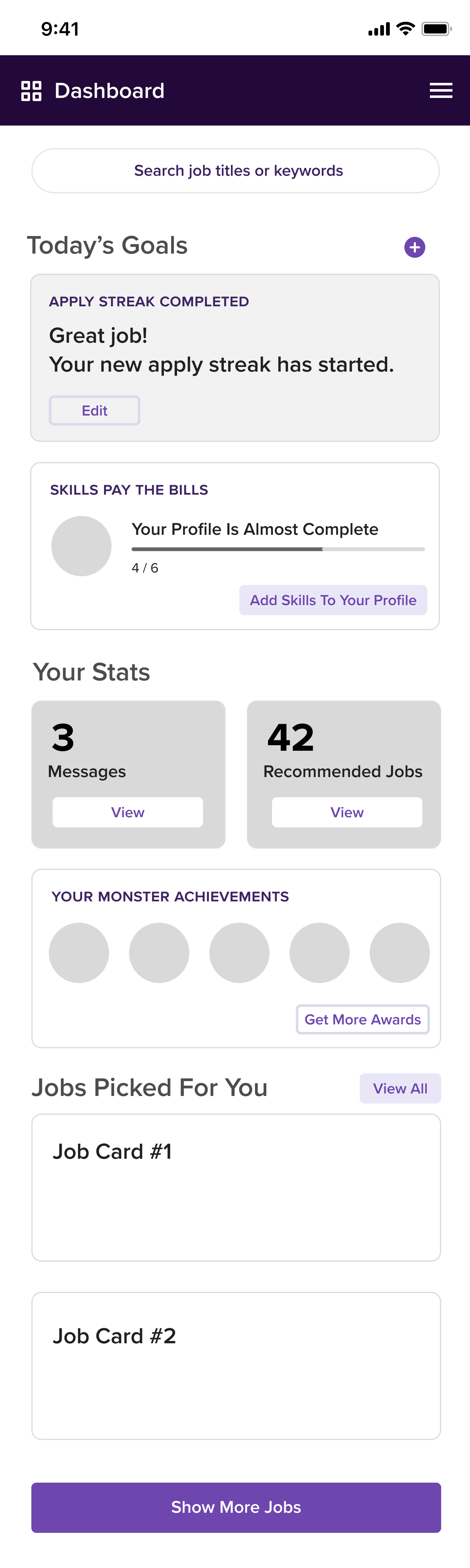
Mobile Web
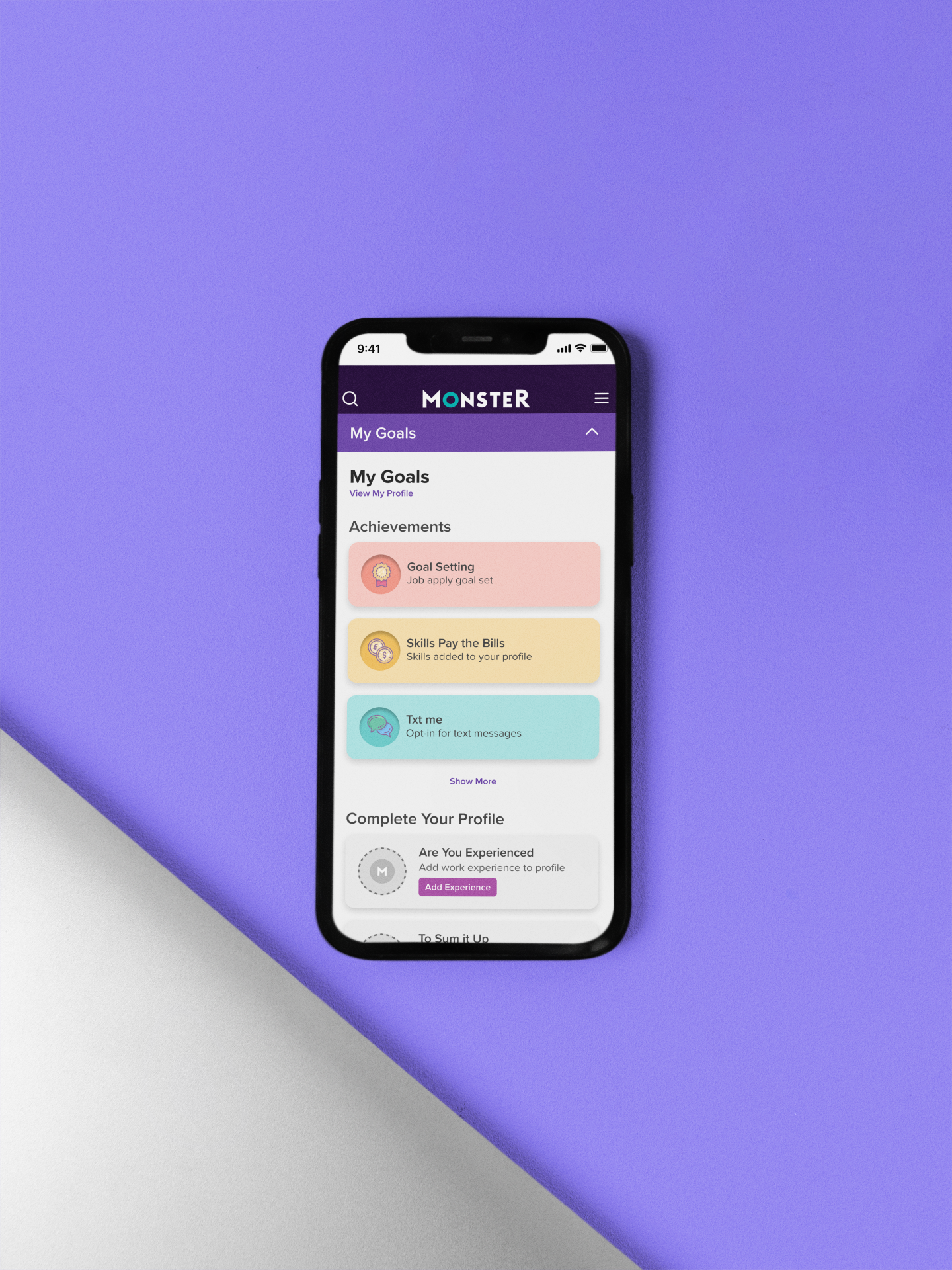
Achievement Badges
Early Wireframe
Early Wireframe