Overview
Project: Redesigning the Onboarding Flow for Monster.com
Role: Lead UX Designer
Team: UX, UI, Product, Engineering
Timeline: 6 months
Tools: Figma, UserTesting
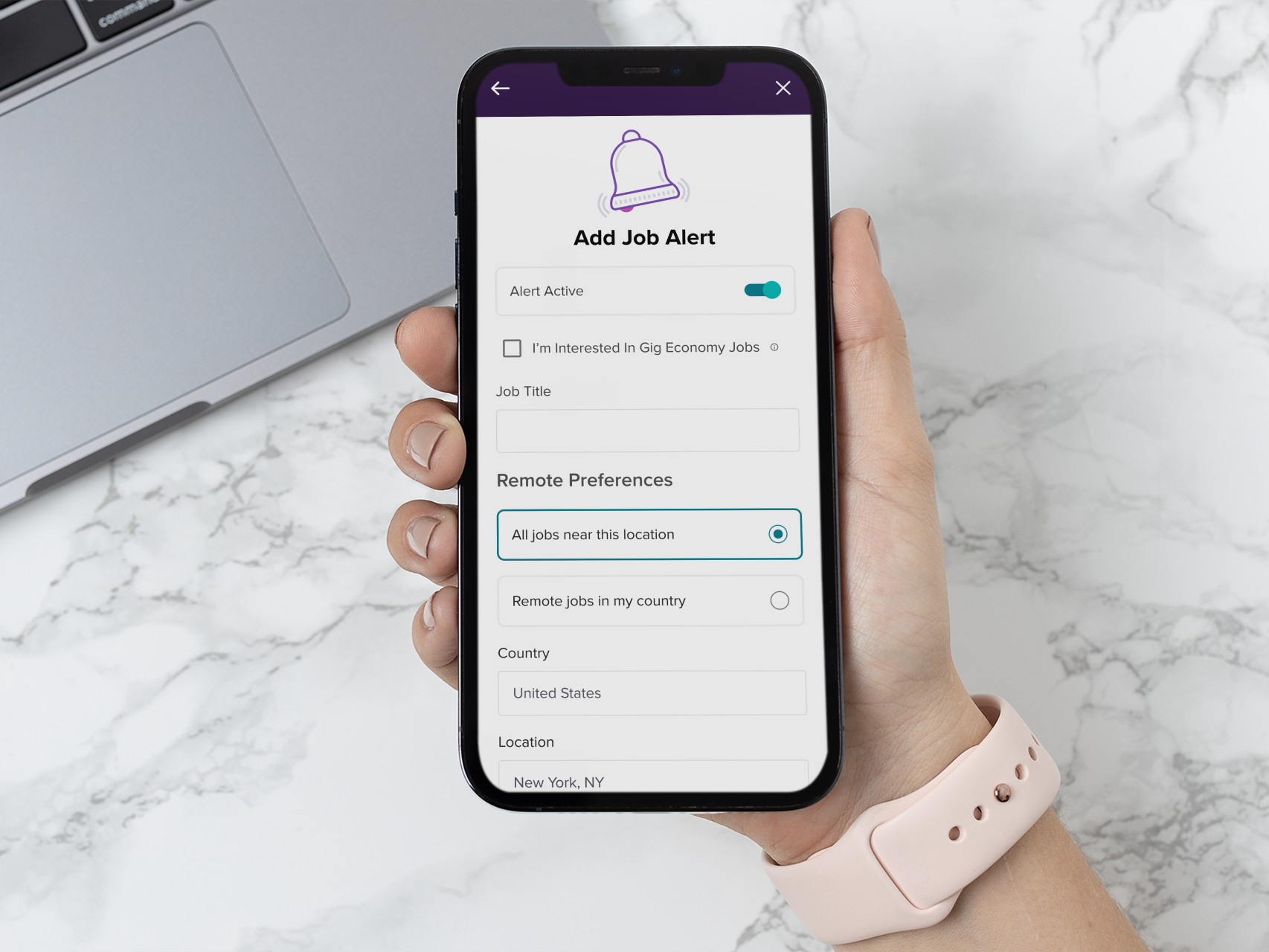
Platforms: Web & Mobile Web
Location of Impact: Global rollout across US, UK, CAN, and select EU markets
Role: Lead UX Designer
Team: UX, UI, Product, Engineering
Timeline: 6 months
Tools: Figma, UserTesting
Platforms: Web & Mobile Web
Location of Impact: Global rollout across US, UK, CAN, and select EU markets
The Problem
Monster.com’s revenue relies heavily on two key user actions:
1. Job seekers uploading resumes
2. Employers being able to search complete profiles
However, users were abandoning onboarding because the product was asking for too much upfront without establishing clear value. The problem wasn’t the UI—it was sequencing and trust.
What I Changed About the Problem
Initially, onboarding was treated as a form-completion problem. I reframed it as a prioritization problem—what is the minimum information we need to deliver value?
Monster needed a solution that would:
• Improve onboarding completion rates
• Increase the number of uploaded or built resumes
• Support future A/B testing via modularity
• Maintain or improve the current conversion baseline
Target users were job seekers aged 18–45 across global markets, many of whom were using mobile devices in low-attention contexts.
Process
Discovery
• Analyzed funnel data: discovered drop-offs spiked after page 1, especially on mobile.
• Conducted a heuristic evaluation of the current onboarding flow.
• Performed competitive benchmarking across top job platforms and mobile-first apps.
• Partnered with the Research team to gather voice-of-customer feedback and historical support tickets.
Definition
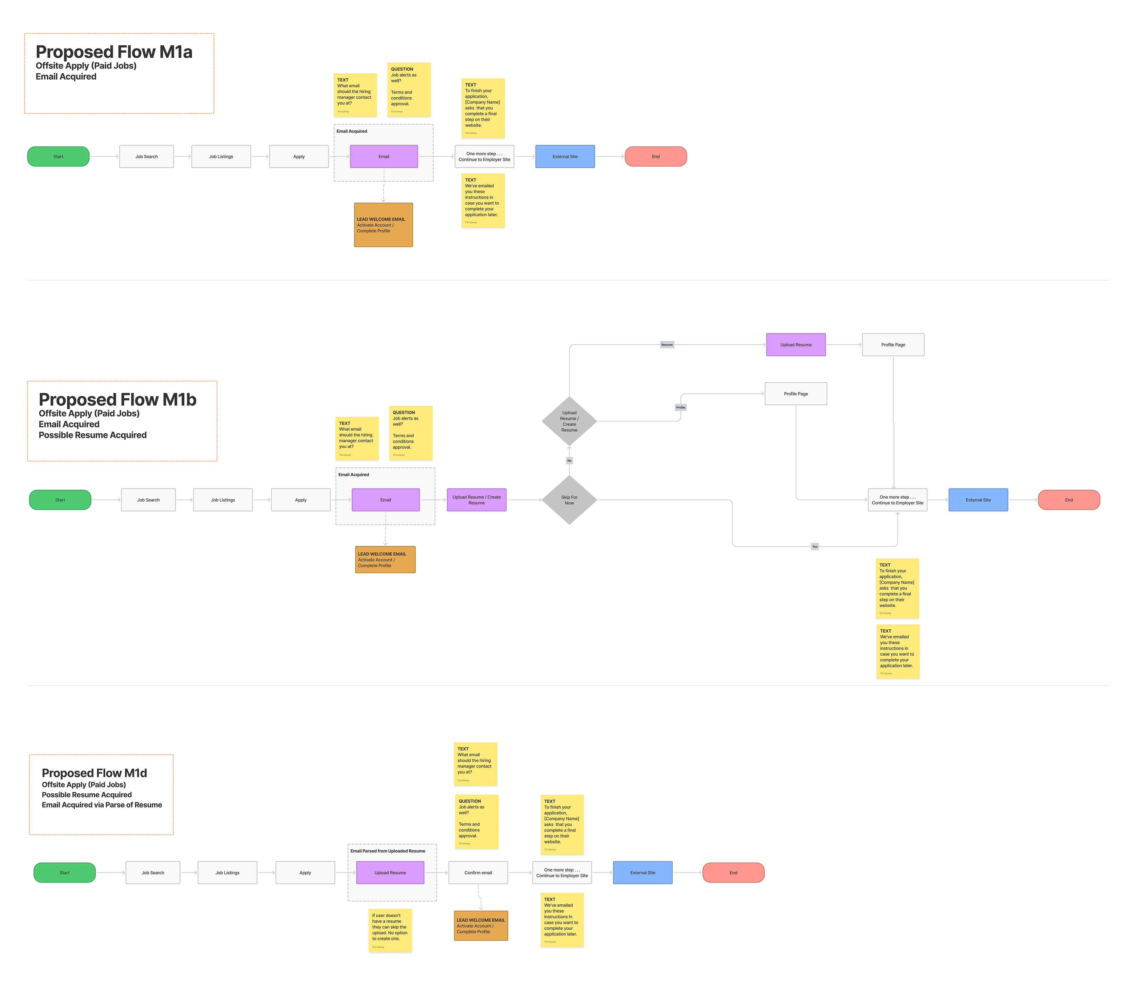
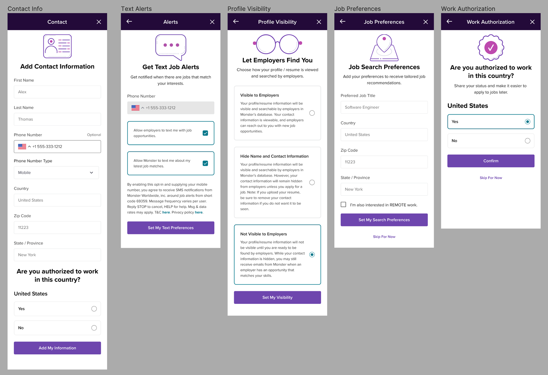
• Defined the onboarding as a modular conversion funnel, where steps could be rearranged or tested independently.
• Created user journey maps showing three entry points:
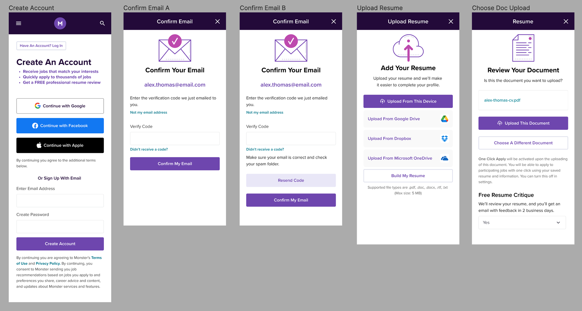
1. Create account > Upload resume
2. Apply to job > Build resume
3. No account > Onsite application
• Identified "uploading a resume on mobile" as a key friction point.
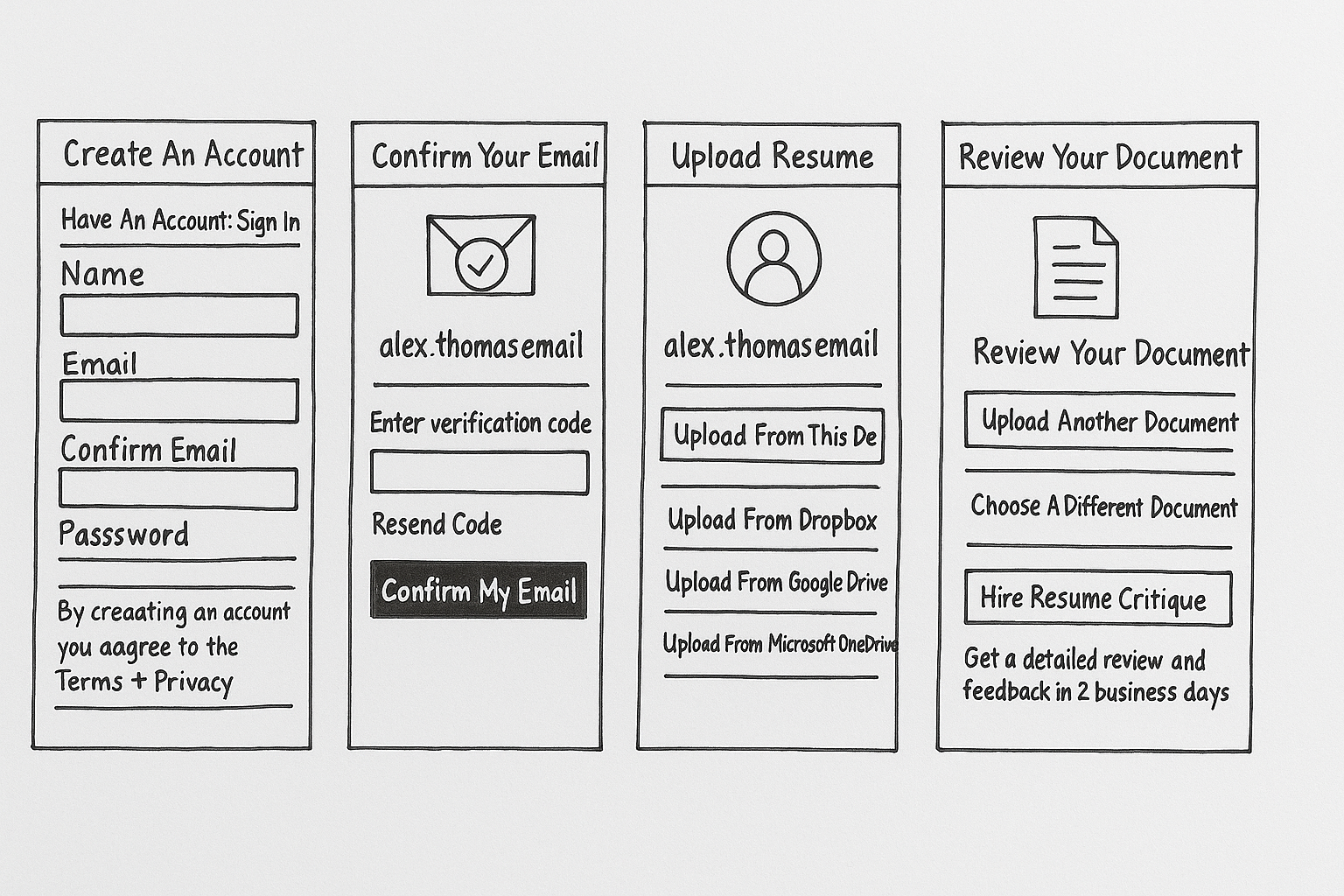
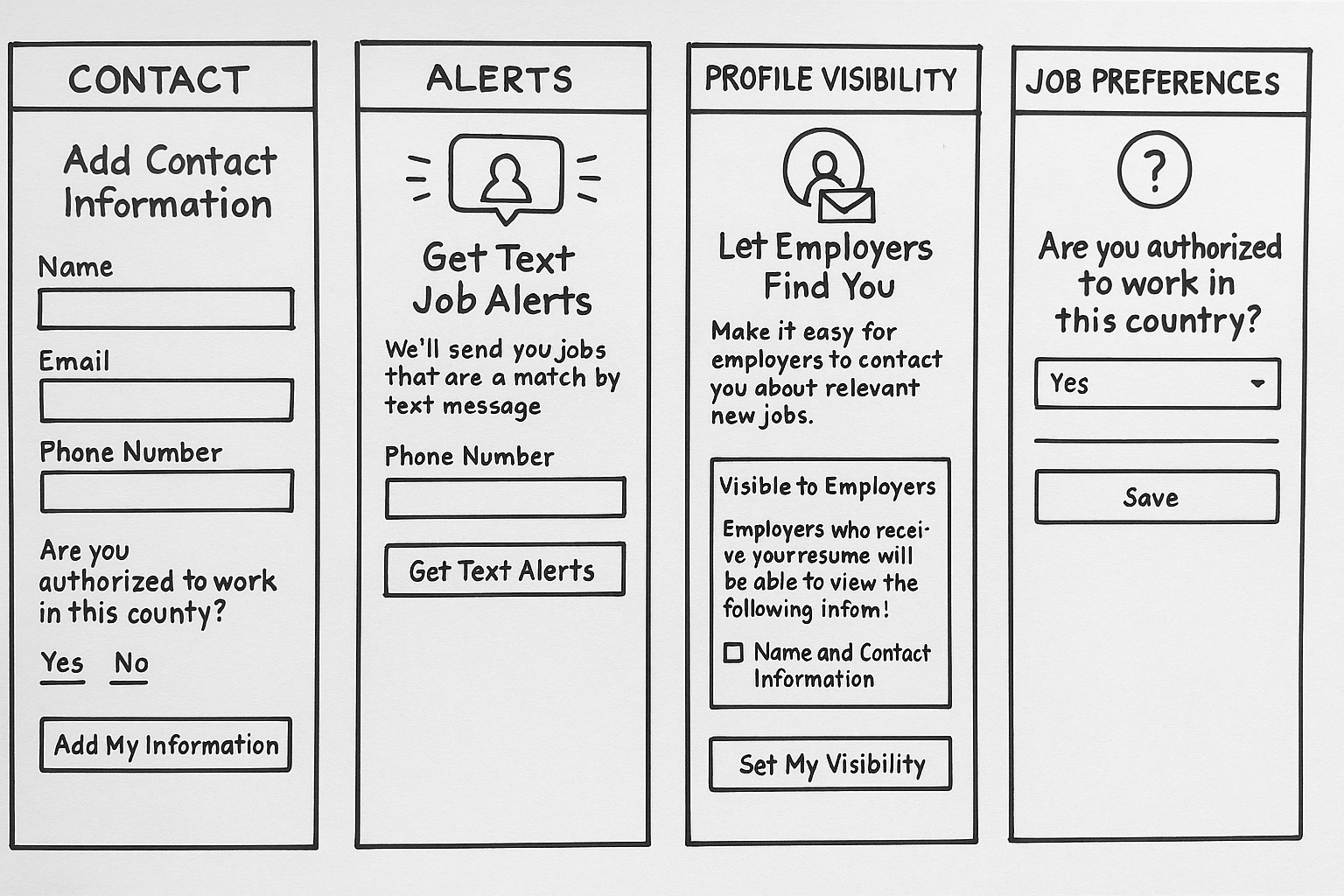
Ideation & Design
• Broke onboarding into modular steps with visual segmentation (using icons, spacing, and affordances).
• Introduced resume-building UI as a fallback for users unable to upload files.
• Explored a progress indicator but shelved it due to dev constraints; kept UI structured to imply progress.
• Used Figma for rapid prototyping and cross-team collaboration.
Testing & Iteration
• Ran usability testing comparing old and new flows.
• Insights: users reported feeling more “in control” with a modular design.
• Iterated on step language and entry points based on feedback and analytics.
• Weekly design reviews and decision-making with product stakeholders ensured tight feedback loops
MetricResult
Completion Rate 90%
Resume Upload Success (Desktop) 100%
Resume Upload Success (Mobile) 60%
Time to Complete Profile (Resume Upload Path) Avg. 2.5 min
Time to Complete Profile (Resume Build Path) Avg. 5.2 min
One-Click Apply Awareness (Post-Onboarding) 70%
Satisfaction Rating (1–5) Avg. 4.2
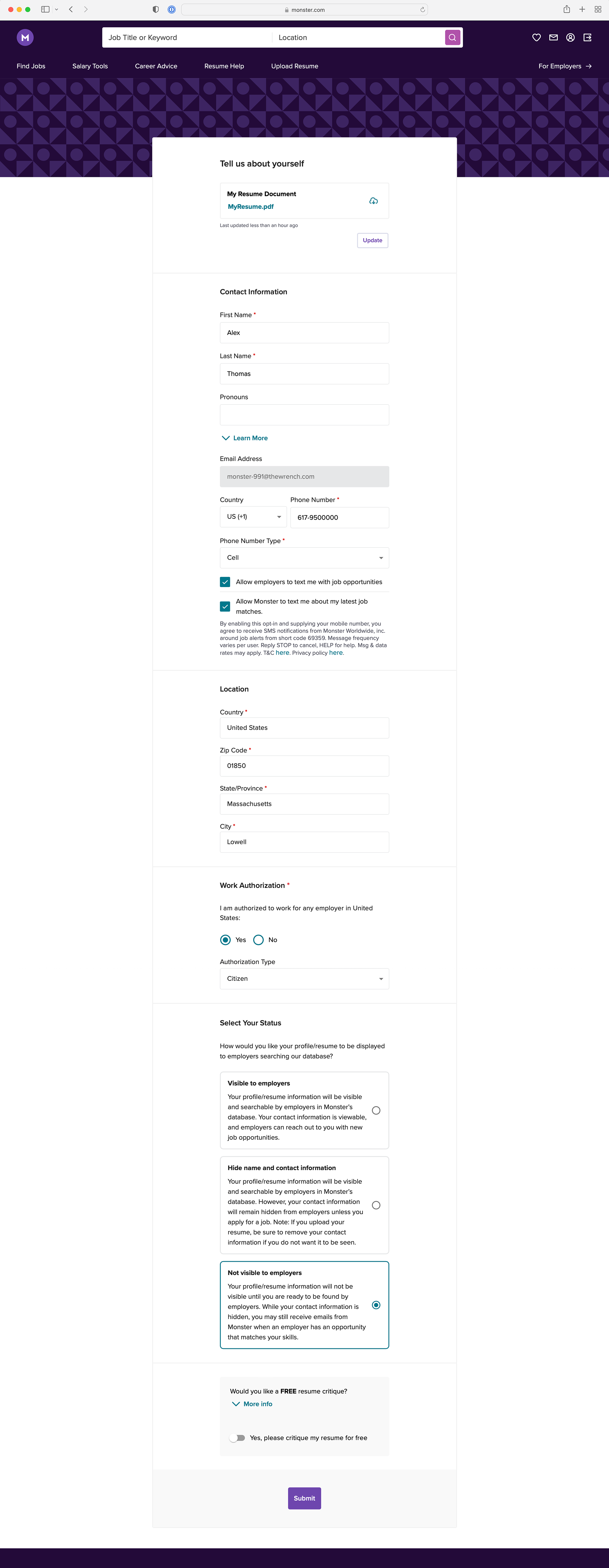
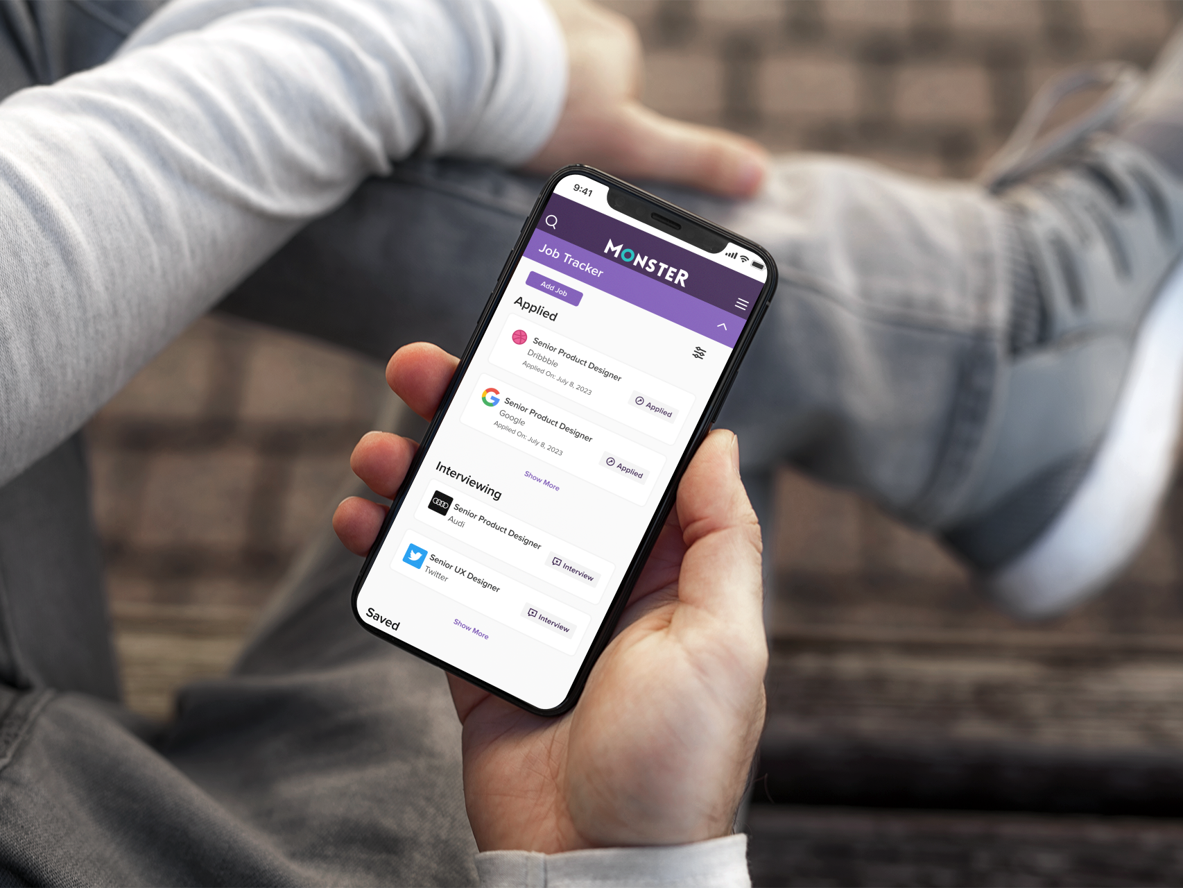
The Solution
The new onboarding flow was:
Modular: Each step could be tested, removed, or reordered.
Mobile-friendly: Resume-building interface worked seamlessly on mobile.
Behavior-driven: Tracked which flows users came in through and adapted accordingly.
Forward-looking: Created infrastructure for One-Click Apply (enabled upon resume upload).
Tradeoffs: We chose not to collect full profile data upfront, knowing it would reduce data completeness but increase completion and engagement.
Results
• 8% increase in onboarding completion during A/B test in UK
• Rollout expanded to US and other global regions
• Notable reduction in drop-offs during the initial onboarding stage
• Challenge: Drop-off still occurred during work/education history input
• Solution: Switched that section back to a longer form after seeing continued friction in stepper format
• Rollout expanded to US and other global regions
• Notable reduction in drop-offs during the initial onboarding stage
• Challenge: Drop-off still occurred during work/education history input
• Solution: Switched that section back to a longer form after seeing continued friction in stepper format
Collaboration & Leadership
• Led cross-functional collaboration across product, dev, marketing, and research
• Advocated for design trade-offs that balanced dev effort with user value
• Established a design system mindset for onboarding modules, setting precedent for future onboarding work
• Drove alignment sessions with stakeholders to ensure onboarding supported business KPIs (resume completeness, user retention, and employer satisfaction)
Reflection
Increased onboarding completion and improved engagement with core features immediately after signup. However, our assumption that a stepped format would help all areas didn’t hold true for the work and education section — users preferred to input that data in a single longer view.
Next time, I’d:
• Conduct deeper task-based usability testing earlier
• Include a mobile-first deep dive before full flow ideation
• Prototype fallback experiences for input-heavy sections earlier in the process

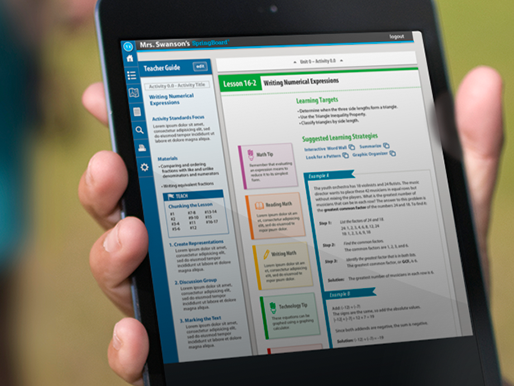
Previous Onboarding